

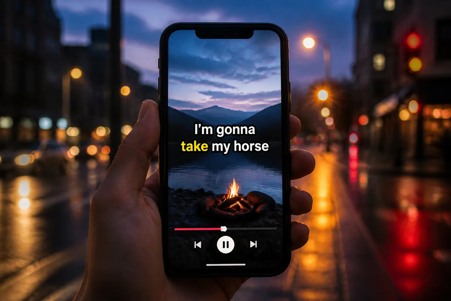
Most viewers scroll with sound off and bail the moment captions get hard to read. Animated karaoke subtitles fix that by giving the eye a clear path that matches the audio. The trick is to mix strong readability with subtle motion, then ship fast to every platform. Below are 10 styles, grouped into a simple workflow you can reuse inside an animated karaoke subtitles editor.
Readability that survives any background
Readable captions beat pretty captions. Start with a bold sans serif, high contrast, and sizes that match your frame.
- 1) High-contrast fonts with smart color fills. Use a clean sans like Inter, Montserrat, Helvetica, or Poppins. For 1080x1920, set 60 - 72 px for talk-to-camera and 72 - 88 px for lyric videos. Fill: pure white (#FFFFFF). Stroke: 3 - 5 px black (#000000) or your darkest brand tone. Shadow: 20% black, 2 px Y offset, 8 - 12 px blur. If your footage is bright, add a semi-transparent backdrop at 30 - 40% opacity with 8 - 12 px corner radius. On longer lines, bring in a muted brand color for the fill or outline so the style pops without shouting.
- 5) Two-line stagger for fast talkers. Split lines to ~28 - 34 characters per line and keep the block width to 75 - 85% of the frame. If delivery is quick, animate the second line 120 - 160 ms after the first. Use the same size and weight for both lines so the block feels stable. This gives viewers a breath between thoughts without slowing the pace.
Small spacing tweaks pay off. Set line height to 110 - 125% and tracking to −1% to 0 so letters feel tight but not cramped. Keep casing consistent. Title Case can look shouty at scale, so sentence case is usually calmer and easier to scan.
Timing and motion that map to speech and music
Motion should guide the eye, not jiggle it. Keep animations subtle and predictable so the text stays easy to parse.
- 2) Word-by-word highlight that tracks speech. Fill each word as it is spoken so the viewer’s focus lands exactly where you are. This classic karaoke effect boosts comprehension on fast delivery and dense phrasing. In SubtitlesFast, AI Subtitles provide word-level highlighting, so the animation locks to the correct word as you talk.
- 3) Beat-pulse captions for music-driven edits. If your cut follows a song or punchy sound design, let each word gently scale up 1 - 3% or glow on-beat. Keep the pulse subtle so the baseline layout stays stable. Timeline Editing and Add Music make it simple to align pulses with kick, snare, or riser hits without breaking your flow.
- 4) Underline sweep as a progress bar. A thin underline that travels left to right under the lyric guides the eye and reduces scanning jumps. Set the sweep height to 6 - 10 px on 1080-wide frames and use a bright accent that differs from your word-fill highlight. It should read as a progress cue, not a second caption.
- 6) Small marker accent for emphasis. A dot, caret, or bar that nudges along the baseline adds rhythm without blocking the frame. Keep it a few pixels below the descenders so it never collides with letters. If you collect reference clips from top creators, X-Post-Copier can pull post text and media into a swipe file so you can study how they time emphasis.
Set durations to fit natural speech. Most viewers read cleanly at ~15 - 20 characters per second. If a line exceeds that, split it or slow the highlight. Use easing that feels invisible, like linear or very light ease-in-out on fills, so attention stays on the words, not the animation.
Layout that fits the feed
Keep captions out of UI overlays and away from faces. Your layout should travel from Shorts to Reels to TikTok without last-minute fixes.
- 7) Safe-zone placement for mobile feeds. Stick to a padded lower third and reserve 8 - 10% margins on all sides. On 1080x1920, that is ~85 - 110 px of breathing room. Lower captions sit nicely 220 - 300 px above the bottom edge to avoid action buttons and song stickers. Use Change Aspect Ratio to test your layout in 9:16, 1:1, and 16:9 before you publish.
- Center vs lower-third. For lyric videos or reels where the subject is off-center, a centered caption block can outperform. For talk-to-camera, lower-third usually wins because it keeps eyes near the mouth while leaving room for b-roll frames or product shots above.
- Background safety. If your footage has frequent contrast shifts, add a soft panel behind the text at 30 - 40% opacity. Keep padding generous: 24 - 36 px inside the box for 1080-wide frames so text does not kiss the edges.
Brand-safe templates you can reuse
Consistency builds recall and saves edits from death-by-tweaking. Lock your look once, then apply it with a click.
- 8) Brand-safe templates you can reuse. Save a template with your approved font pair, color set, and animation style so every video looks like you. SubtitlesFast includes Subtitle Style Customization with 30+ animated styles plus Karaoke Style Subtitles, so you can dial in a look you love and apply it across projects.
- Preset suggestions. Make two go-to looks. A talk-to-camera preset: bold sans, white fill, dark stroke, bright word highlight, tight tracking, faster fill speed. A lyric-forward preset: slightly heavier underline, slower word fill, and a softer drop shadow so the text feels fused to the beat. Name them clearly and save them to your workspace for one-click reuse.
Bonus: if your brand uses seasonal palettes, create alternates with only the highlight and underline colors swapped. Keep core readability settings identical so performance comparisons stay fair.
Translate, export, and measure
When a clip hits, ship it again in another language and make sure your styling survives every repost.
- 9) Translated singalong for global reach. Translate Subtitles keeps timing in sync so the highlight animation still reads like karaoke. Pick a font with strong multilingual support for accents and non-Latin scripts. For right-to-left languages, flip alignment to the right and confirm the word highlight direction matches reading order. Use your ai subtitles generator to add subtitles to video online without juggling files.
- 10) Burn-in and export presets that travel anywhere. Some platforms strip sidecar caption files. Burn subtitles into video so your style survives re-uploads, edits, and reposts. SubtitlesFast offers Burned-In Subtitles that work cleanly across TikTok, YouTube, Instagram, and X, plus an AI Thumbnail Generator to create a matching cover after you export.
Export settings that work well for most vertical posts: 1080x1920, 24 or 30 fps, H.264, and 12 - 16 Mbps bitrate. Keep audio at 48 kHz, 256 kbps AAC. If you edit in 16:9 for long-form, generate a parallel 9:16 render from the same timeline so the caption styles match.
Measure the change, not the vibe. Publish three posts with the same topic and hook, each using one caption style. Track average watch time, completion rate, and comments that quote your lines. On YouTube, scan the retention graph for dips during dense lines. On TikTok and Reels, compare average watch time to total duration. If viewers fall off during fast sections, switch to the word-by-word highlight or add the two-line stagger and retest.
Pick one style this week, set it up once in your animated karaoke subtitles editor, and watch what happens. The right mix of contrast, timing, and placement will keep more eyes on your story without stealing focus from the video itself.
Key takeaways
- High contrast plus gentle motion keeps captions readable without chaos.
- Word-level highlights and subtle beat cues help viewers track fast speech and music.
- Templates, aspect ratios, and burn-in exports speed up cross-platform posting.
- Translate proven clips to grow outside your home language.
- Test one change at a time and measure watch time over three posts.
FAQ
What is the fastest way to add karaoke captions to a video?
Use an animated karaoke subtitles editor with AI Subtitles. It can auto-transcribe, then you apply a word-by-word highlight style and export with burn-in.
Should I burn subtitles into video for TikTok and YouTube?
Yes. Burned-in subtitles keep your animated style intact across re-uploads, stitches, and reels, and they avoid platform caption quirks.
What fonts work best for karaoke subtitles on mobile?
Bold sans serif fonts with solid fills, a dark stroke, and a light shadow. They stay readable on busy footage and small screens.
How do I keep captions from covering important parts of my video?
Use safe-zone padding and test layouts in 9:16, 1:1, and 16:9. Keep the caption block in the lower third with margins clear of UI elements.
Can I translate karaoke captions without re-timing?
Yes. Translate Subtitles keeps timing while swapping the text, so the highlight animation still matches the audio.