

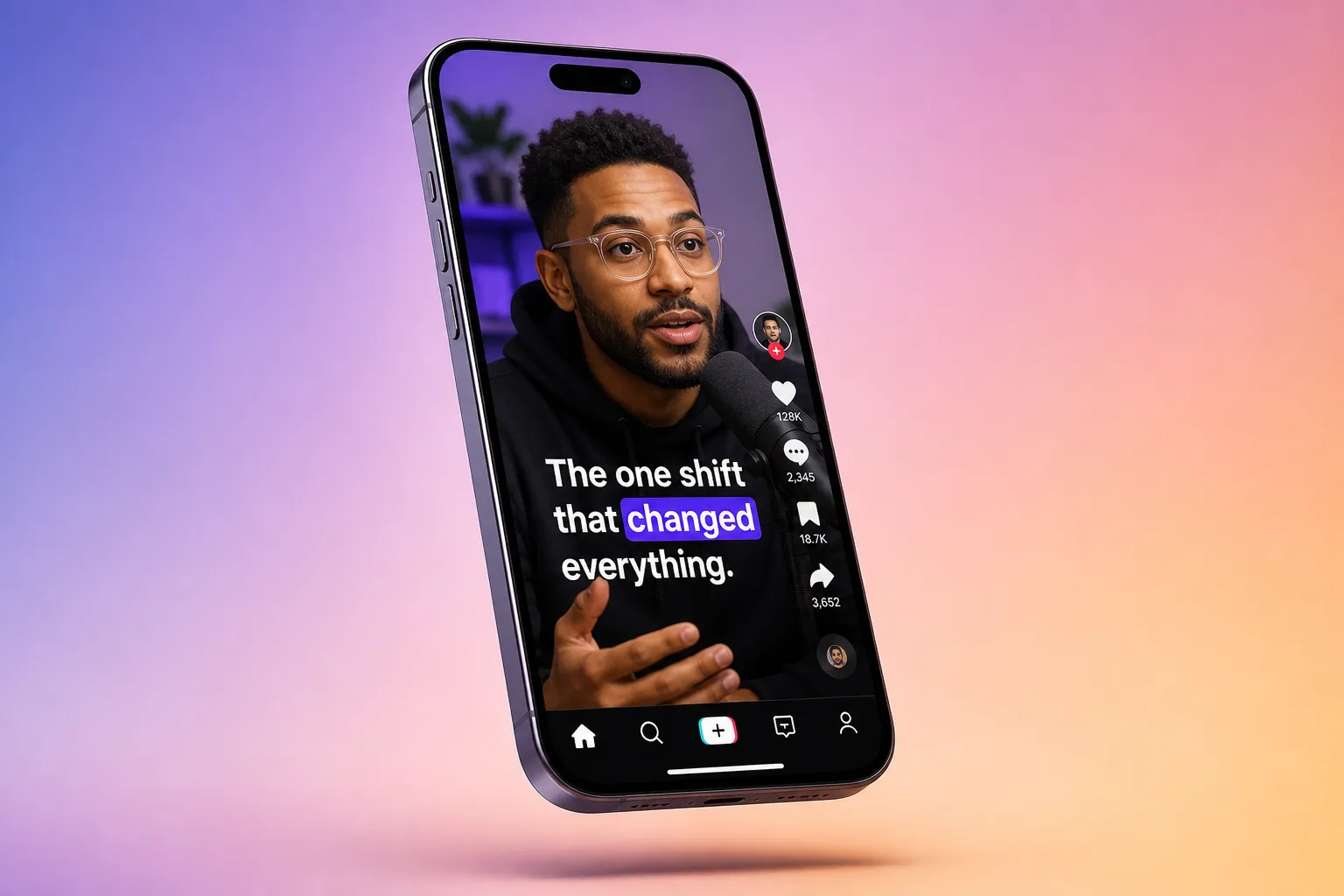
Subtitles are part of your brand system. Viewers notice when type jumps around, colors clash, or animations look noisy. The fix is a small set of rules you can reuse across every video so your captions look like you meant it, not like a last-minute overlay.
Below is a practical playbook for subtitles that are on-brand, easy to read on a phone, and consistent across platforms.
Build a simple subtitle style guide
Create a one-page style sheet just for captions. It removes guesswork when you add subtitles to video online and keeps every editor on the same page.
- Typeface: pick one clean sans serif for body text. Inter, DM Sans, Helvetica Neue, or Arial all work well. Save decorative type for headings or one-off callouts.
- Size: aim for 4 to 6 percent of the video height for body captions on mobile. For 1080x1920, that is about 44 to 64 px. Bump speaker labels or headings by 10 to 20 percent.
- Line length: keep to 28 to 42 characters per line. Cap at two lines to avoid covering faces or UI.
- Casing and spacing: sentence case reads fastest. If you use ALL CAPS, add 2 to 4 percent letter spacing so it does not feel cramped.
- Timing: keep each subtitle on screen at least 1 second and no longer than 6 seconds. Target 140 to 180 words per minute or about 15 characters per second.
- Placement: center bottom with consistent margins. Set a baseline now so you do not eyeball it later.
If you want quick consistency, an AI subtitles generator that also lets you style text helps a lot. With SubtitlesFast, you can generate AI Subtitles in 50+ languages, then apply Subtitle Style Customization to lock in fonts, sizes, colors, and animations so every new video starts on-brand. That simple combo saves you from redoing choices every time you edit.
Color, contrast, and effects that stay legible
Your palette can live in your captions without hurting readability. Use contrast rules you can check, and set effects once so they do not change clip to clip.
- Contrast: aim for at least a 4.5:1 contrast ratio between text and the immediate background. A darker variant of your primary color often beats the exact brand swatch.
- Outline and shadow: if backgrounds change, add a 2 to 4 px stroke at 1080-height scale or a soft shadow with 30 to 50 percent opacity and 4 to 6 px blur. Keep offsets subtle so letters do not glow.
- Background box: for busy shots, a semi-opaque box at 60 to 80 percent opacity with 8 to 12 px padding can save readability. Round corners lightly to match your brand UI.
- Accent style: define a second style for keywords. For example, body in white with a charcoal outline, accents in your brand blue or a bold weight. Use sparingly for product names, CTAs, or numbers.
In SubtitlesFast, Subtitle Style Customization gives you control over fills, strokes, shadows, and 30+ animated presets. Build a default style that hits contrast targets, then a named accent style for emphasis. You can switch styles inline without breaking your system.
Animation that guides the read, not steals the shot
Motion should help viewers find the next word and keep pace with the speaker. Subtle beats sticky. Set a small toolkit and reuse it.
- Intro and outro: use short fades or pop-ins at 120 to 200 ms. Avoid bounces or large slides that pull attention away from the subject.
- Word-level focus: Karaoke Style Captions are great for pacing because they show exactly where to look. Keep the highlight color on-brand and the sweep synced to speech.
- Speed: align highlight timing to natural phrasing, not uniform chunks. Long words need more time; short connectors can move faster.
- Consistency: the same easing and duration across cuts feels intentional. Save special effects for rare emphasis.
SubtitlesFast includes Karaoke Style Subtitles with word-level highlighting and an animated karaoke subtitles editor feel. It works especially well for auto captions for TikTok and YouTube where viewers skim and appreciate a clear reading path.
Safe zones, aspect ratios, and export
Captions compete with platform UI. Set safe zones by format and preview before you export so nothing gets covered by likes, progress bars, or lower-thirds.
- 9:16 vertical (TikTok, Reels, Shorts): keep the baseline 8 to 10 percent above the bottom edge and leave 4 to 6 percent margin left and right.
- 1:1 square (Feed posts): similar bottom margin, but watch lower thirds from app overlays or carousel dots.
- 16:9 horizontal (YouTube): you can sit lower, but leave 5 to 6 percent for player controls on mobile and TV interfaces.
- Line spacing: set 110 to 130 percent so two-line captions breathe without covering the subject’s mouth.
Use Change Aspect Ratio in SubtitlesFast to switch between 9:16, 1:1, and 16:9 and preview safe zones for TikTok, YouTube, Instagram, or X. If your distribution calls for hard-coded text, SubtitlesFast lets you burn subtitles into video so your style, alignment, and spacing survive every upload and re-share. Export at platform-native sizes like 1080x1920, 1080x1080, or 1920x1080, and stick to a common frame rate you shot at to avoid jitter.
Templates and a repeatable team workflow
Templates turn style choices into speed. You do not need a complex brand kit in your editor. Duplicate a recent project that already uses your chosen font, size, colors, karaoke subtitles, and placement. Update the script, then trim or rearrange on the Timeline Editing track. Over time, you will have reliable starters for product demos, explainers, and shorts.
In SubtitlesFast, you can reuse the same Subtitle Style Customization settings, then Translate Subtitles for multilingual versions without guessing at line breaks or font weights each time. If you publish in languages with different glyph sets, pick fonts with full Latin and non-Latin support or set fallbacks to avoid missing characters. Add Music from within the editor to keep audio on-brand, and use the AI Thumbnail Generator so your cover art matches the captions. For teams planning a broader publishing cadence, this deep dive on RankGoat’s done-for-you blog writing service vs SEO agencies on pricing, content, and backlinks is a useful reference for how captioned videos fit alongside search-driven posts.
Good branded subtitles look simple because the decisions sit under the surface. Set type, contrast, animation, and safe zones once, then repeat them. SubtitlesFast makes it easy to add subtitles to video online with AI Subtitles, style them with Karaoke Style Captions, adjust for any platform with Change Aspect Ratio, and export Burned-In Subtitles for worry-free sharing.
Key takeaways
- Write a one-page caption style guide: typeface, size, casing, timing, and placement.
- Use 4 to 6 percent of frame height for body text and keep lines to 28 to 42 characters.
- Hit strong contrast; add a 2 to 4 px outline or soft shadow when backgrounds shift.
- Use Karaoke Style Captions for word-level pacing with an on-brand highlight color.
- Preview safe zones with Change Aspect Ratio and leave 8 to 10 percent bottom margin in 9:16.
- Burn subtitles into video to preserve styling across platforms and re-uploads.
- Build reusable templates and keep your look consistent clip after clip.
FAQ
What font size works best for mobile subtitles?
Aim for a base size roughly 4 - 6% of the video height for mobile. Preview in 9:16 and adjust up for long sentences or complex backgrounds.
Should I use brand colors for subtitles?
Yes, as long as contrast stays strong. If your palette is light, pick a darker variant for text and add a thin outline to keep letters readable.
Are karaoke-style captions good for every video?
They work well for short, fast content and tutorials because they guide the eye. Keep highlights subtle and synced so they do not distract.
How do I keep captions readable on TikTok and YouTube?
Test 9:16 and 16:9 layouts, keep subtitles above UI, and use outlines or shadows. SubtitlesFast lets you change aspect ratio and preview before export.
When should I burn subtitles into a video?
Use burned-in subtitles when you want your exact styling everywhere or expect re-shares. They keep your brand look intact across platforms.