

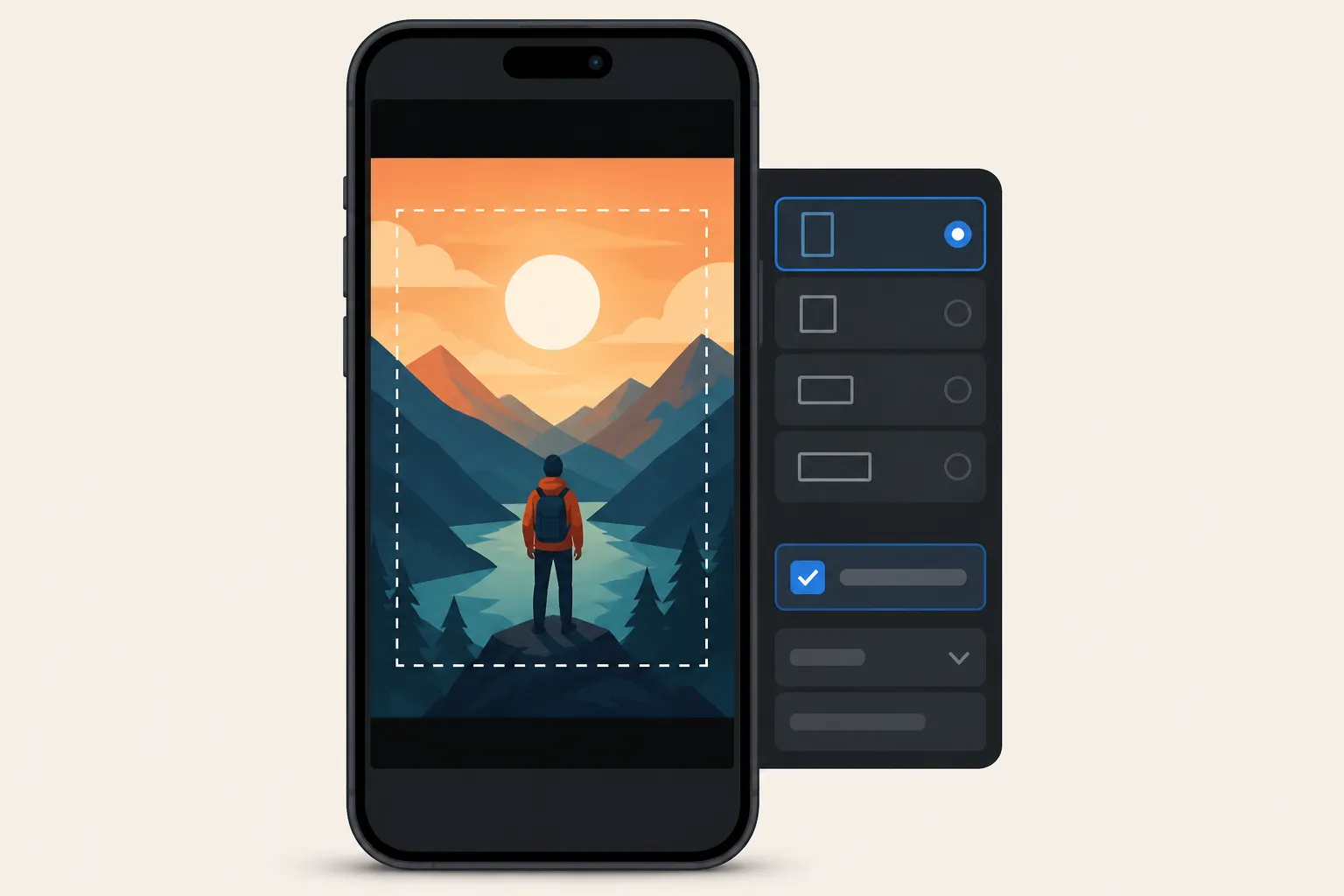
Your captions look sharp in the editor, then TikTok covers them with buttons. You upload to Shorts and the text hides under the progress bar. Reels shifts your lower third just enough to break a line. One fix: set social export presets that lock aspect ratio, safe zones, and burn-in before you export.
Use this practical checklist to set presets once, export fast, and keep subtitles readable on every feed without redoing your edit. There is also a quick reference for common ratios and safe zones, plus a simple way to set it all up inside SubtitlesFast.
Your social export presets checklist
- Pick your primary aspect ratio before you edit. Choose 9:16 for TikTok, Reels, and Shorts, 16:9 for standard YouTube, or 1:1 if you still post to square feeds. If you are repurposing a 16:9 interview for 9:16, reframe the subject above center so captions have breathing room. Setting this first prevents last-minute crops and keeps captions from shifting.
- Create separate presets per platform. Even within 9:16, app UI differs. TikTok stacks icons on the right and shows description above the progress bar. Shorts has a taller progress bar and tighter bottom margin. Reels adds a caption line under the frame. Save one preset for TikTok, one for Reels, and one for Shorts so your captions always sit above progress bars and out of the icon stack.
- Define safe zones with margins. As a starting point, keep text at least 10% from the left and right, 15% from the bottom, and 10% from the top. For a 1080x1920 export that equals about 108 px side padding, 288 px bottom padding, and 192 px top padding. This avoids overlap with avatars, descriptions, and playback controls that apps add.
- Position captions high enough for thumbs and toolbars. Set the caption baseline so the lowest line never dips into your bottom safe zone. On vertical video, a baseline around 22-25% up from the bottom usually clears fingers and toolbars while staying close to the subject.
- Limit to two lines with short phrases. Two lines hold steady across crops and small screens. Aim for clean phrases and keep each line under roughly 35 characters in English. Break on natural pauses to reduce wrap and prevent orphan words.
- Set a mobile-first font size. Start at 42-48 px on 1080x1920 exports (28-32 px on 720x1280), then preview at arm’s length on a phone. If you have long names or technical terms, size up rather than shrinking the text to fit. Legibility beats squeezing everything onto one line.
- Increase contrast with backgrounds or stroke. Use a semi-opaque box (40-60% opacity) or a 2-3 px stroke so subtitles stay visible on bright footage. High contrast wins on sunlit feeds and dim screens alike.
- Choose a readable animated style. If you add motion, pick subtle reveals that do not jump outside the safe zone. A light fade or slide is enough. A subtle karaoke highlight effect helps viewers track the words without blocking the frame.
- Use karaoke style captions for key moments. Word-level highlighting guides the eye during hooks, punchlines, quotes, and lyrics. Reserve heavier animation for short segments so it feels intentional and does not compete with the visuals.
- Set consistent line height and spacing. 120-140% line spacing keeps two-line captions airy on small screens. Tight lines blur together after platform compression, especially on busy backgrounds.
- Lock color and brand rules into the preset. Define font family, weight, color, box opacity, and animation once. A consistent look across platforms makes your clips recognizable and speeds reviews because there are fewer style decisions per export.
- Plan for translation expansion. Some languages expand 15-35%. Leave headroom in your safe zone and keep lines short so Translate Subtitles does not push text into UI areas. If you publish in right-to-left languages, check that alignment and punctuation stay clean.
- Auto-generate captions, then fix timing on a timeline. Start with an AI subtitles generator for speed, then review line breaks and timing on a simple timeline. Aim for readable display times (about 1.5-3.5 seconds per subtitle) and keep the cut points aligned with the speaker’s cadence. Clean timing beats word-perfect transcripts for comprehension.
- Check the first and last three seconds. App overlays are most aggressive at the start and end. Make sure your opening hook and closing CTA sit clear of progress bars, buttons, and any end screen elements.
- Burn subtitles into video for social uploads. Burned-in captions prevent platform styles from altering your look and keep placement consistent across apps. If a platform supports closed captions well, you can export a variant for accessibility, but the burn-in preset is the safest default for shorts.
- Name and document your presets. Use clear labels like "TikTok 9:16 High" or "Shorts 9:16 Mid" and note safe zone values. Keep a short doc with examples and when to use each preset. Treat presets like a repeatable publishing checklist so your team ships on time. If you organize distribution and SEO with something like RankGoat, manage these presets with the same rigor.
- Test on-device before you batch. Export a 10-15 second clip using each preset and preview on actual phones. Check at 100% zoom, in bright light and low light, and on both iOS and Android. Real-world checks beat any desktop preview.
- Save an audio mix variant when needed. If music competes with speech, keep a "voice-first" preset and a "music-forward" one. As a rule, dip music under dialogue and make sure captions remain readable over the mix.
- Create a thumbnail preset too. Text-safe zones and aspect ratio matter on thumbnails as well. Lock a visual style that matches your captions so feeds feel consistent, and keep any thumbnail text inside the same safe zones you use in video.
Platform quick reference
Aspect ratios to set in your presets
- TikTok, Instagram Reels, YouTube Shorts: 9:16 (1080x1920 or 720x1280). This is the vertical default most viewers see. If you shoot 4K vertical, export 1080x1920 for faster uploads unless you need the extra detail.
- YouTube standard: 16:9 (1920x1080). Use for long-form posts and landscape clips. Lower thirds and graphics often sit here, so float captions a touch higher.
- Legacy feeds or carousels: 1:1 (1080x1080). Still useful for some grid posts. Keep lines shorter because the viewing area is smaller than 9:16.
Caption safe zone guidelines
- Vertical 9:16 feeds: Avoid the bottom 15% and top 10% to clear progress bars, descriptions, and profile elements. Keep captions centered horizontally with 10% side padding to steer clear of right-side icons and left-edge avatars.
- Landscape 16:9: Avoid the bottom 10% and top 8% to clear playback controls. Place captions slightly above center if lower thirds or chapter bars appear near the bottom edge.
- Square 1:1: Similar to vertical, but give a bit more bottom padding because some apps show tall captions or buttons under the frame.
App UI changes often, so treat these as starting points. Do a quick on-device test export any time a platform updates its player.
How to set these presets in SubtitlesFast
Build once, reuse forever. Here is a fast way to lock your workflow inside SubtitlesFast so your exports are consistent.
- Change Aspect Ratio: Pick 9:16, 1:1, or 16:9 to match the platform. This sets your canvas so captions do not get cropped later.
- AI Subtitles: Automatically transcribe your video into subtitles in 50+ languages with word-level highlighting. This gives you clean starting captions for short-form clips and long-form edits.
- Subtitle Style Customization: Choose from 30+ animated styles, then set fonts, colors, stroke or background box, and animation. Position captions inside custom safe zones so they never sit under app controls.
- Karaoke Style Subtitles and Captions: Add karaoke subtitles or karaoke style captions that increase watch time and engagement. Use word-level highlights on your hook or chorus, then switch back to a steady style.
- Timeline Editing: Trim, cut, and rearrange clips on a simple timeline. Fix line breaks and timing where viewers actually read, not just where the transcript splits.
- Translate Subtitles: Generate localized captions for new markets. Leave extra room in your safe zone to account for longer lines after translation.
- Add Music: Drop in a music track and check that captions stay readable over busy sections. Adjust box opacity or stroke if the background gets loud.
- Burned-In Subtitles: Export variants that burn subtitles into video so the look and placement do not change when platforms compress or restyle text. This is the most reliable choice for shorts.
If you prefer to add subtitles to video online and ship quickly, save these as reusable project templates. That way your next batch of auto captions for TikTok and YouTube stays on-brand and inside the safe zone by default.
Key takeaways
- Set aspect ratio first, then design captions inside safe zones for each platform.
- Use readable sizes, high-contrast styles, and two-line limits for small screens.
- Save separate social export presets for TikTok, Reels, Shorts, and YouTube.
- Burn subtitles into video when posting to short-form feeds for consistent placement.
- SubtitlesFast gives you Change Aspect Ratio, Subtitle Style Customization, and Burned-In Subtitles to make this simple.
Make this checklist your baseline. With presets dialed in, you can focus on stronger hooks, smarter edits, and better stories while your captions and karaoke subtitles keep pulling viewers through the cut.
FAQ
What are social export presets?
They are saved settings for aspect ratio, caption style, placement, and burn-in choices you apply before export so captions look correct on each platform.
Where should I place captions for TikTok and Reels?
Keep captions above the bottom 15% of the frame and away from the top 10% to avoid progress bars and profile elements. Test on-device to confirm.
Should I burn subtitles into video for Instagram or Shorts?
Yes for reliability. Burned-in subtitles keep your style and placement intact when platforms compress or restyle text.
How big should captions be on mobile?
For 1080x1920 exports, 42 - 48 px is a solid starting point. Always preview on a phone and adjust based on your footage and style.
Can I use karaoke style captions without blocking the frame?
Yes. Use word-level highlights with subtle animation and keep them within your safe zones. Reserve heavy effects for short moments.