

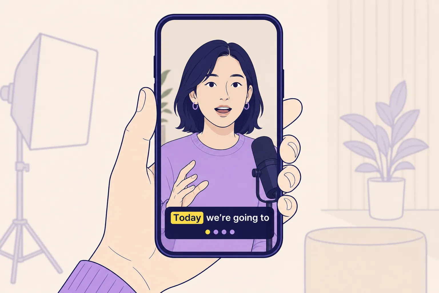
Most TikTok views happen on mute and within seconds. If your captions are hard to read, you lose the swipe. Clear, on-brand subtitles carry your hook, tone, and message without stealing focus. The right workflow lets you add, translate, style, and burn captions fast so your video is ready for TikTok, Reels, and Shorts in one pass.
Here is a practical system using a web-based AI video editor with auto subtitles, styling controls, translation, timeline editing, and quick export. You will set a vertical canvas, generate and clean captions, style for brand recall, sync to rhythm, and export once with burned-in text that survives platform compression and reposting.
Set your canvas for TikTok
Start with 9:16 at 1080 x 1920. Set this before you caption so line breaks and placements do not shift later. Turn on guides and leave safe space where TikTok overlays sit.
- Bottom safe zone: keep captions at least 160 to 220 px above the bottom on a 1080 x 1920 frame so they do not collide with the description, buttons, and progress bar.
- Top safe zone: leave about 120 px at the top to avoid the username and follow controls.
- Side padding: keep at least 60 px on left and right so text is not tight to the bezel on smaller phones.
Place captions just above the bottom safe zone, centered or left aligned, and away from the speaker’s mouth so expressions stay visible. If your subject moves, set two placement presets and switch when needed rather than dragging per line.
Transcribe, translate, and edit fast
Let AI generate the first draft, then do two quick passes. The first is accuracy. The second is pacing.
- Accuracy pass: correct brand names, product terms, URLs, and currency. Replace emoji names with readable words when it helps clarity. Standardize numbers and units.
- Filler cleanup: remove ums and likes unless they deliver character. Use natural punctuation. A comma can make a line feel snappier than a period.
- Reading speed: aim for 14 to 17 characters per second. Keep to two lines max. Cap lines at about 32 characters each. If a line runs long, split at a natural phrase break.
- Line breaking: break after sense units, not mid thought. Good: “Edit faster / with smart captions.” Weak: “Edit faster with / smart captions.”
- Timing trim: set in points 100 to 200 ms before speech starts and out points 100 to 200 ms after it ends. That pre and post roll makes reading feel effortless.
Publishing in more than one language increases reach. Duplicate your caption track and translate with the built-in translator. Keep brand names, product SKUs, and hashtags as written. Watch for idioms that do not translate cleanly and swap to a simpler phrase. For bilingual audiences, you can keep a short English hook as the first line, then switch to the translated track after the first sentence.
If you are auditing a lot of line breaks and your eyes glaze over, take 60 seconds with some free online jigsaw puzzles to reset, then return and recheck readability with a fresh brain.
Style for instant readability and brand recall
Your captions should pass a quick glance test on a small phone in bright light. Use your brand look, but keep contrast high and motion subtle.
- Font and size: choose a sans serif or a clean rounded face. Target 5 to 7 percent of frame height for font size. On 1080 x 1920, that is about 54 to 75 px. Go one step heavier than your brand body weight for mobile clarity.
- Contrast: aim for a contrast ratio near WCAG AA. White text with a 3 to 5 px dark stroke or a soft 30 to 40 percent black shadow is often enough. Avoid big opaque boxes unless your footage is chaotic.
- Color use: keep most text a single neutral color and use your brand accent to highlight 1 to 3 keywords per hook. Too many colors read noisy.
- Karaoke emphasis: for the first three seconds, animate or highlight words as they are spoken. Use a bold highlight color and dim unhighlighted words to 70 to 80 percent, not fully gray, so everything stays readable at a glance. After the hook, dial motion back to a steady fade or pop-in.
- Emoji and symbols: use sparingly and only when they add meaning. Replace complex emoji clusters with a single clear word or symbol.
Save your style as a preset so your next edit inherits the same font, size, stroke, and color choices. Consistency builds recognition and speeds your workflow.
Sync to rhythm and design for every device
Captions feel better when they change on a cut, a beat, or a clear phrase boundary. Use the timeline to micro nudge in and out points so key words land with the rhythm of the edit.
- Beat matching: if you add music, rough in your captions first, then slide change points so strong syllables hit on beat rather than between beats.
- Dead air: trim silences and long pauses so a subtitle is not stranded on screen with nothing happening.
- Camera movement: if you punch in or pan, check that the caption block does not crowd the subject. Nudge placement up a bit during busy frames and return to baseline later.
- Device checks: preview on a small 5.5 inch phone and a larger device. Test outdoors at 50 to 70 percent brightness. If you squint, increase font size one notch and add 1 px to your stroke.
For placement, a practical baseline is to anchor your caption region about 20 to 24 percent above the bottom edge, which keeps it out of the UI while staying in the eye line. If you need to show on-screen text or charts, temporarily move the captions higher and reduce the font size 10 percent for those sections only.
Export once and survive any platform
Different apps render text differently. To keep your look consistent, export one clean master with burned-in captions and, if needed, an extra sidecar file.
- Burned-in subtitles: lock your styling into the video so platform auto captions do not overlap. This also protects your look when a clip is downloaded and reposted.
- Togglable captions: if you want viewers to control captions in app, keep a minimal burned-in line for the hook only and place it higher. Upload an SRT for the full transcript so TikTok can handle toggling without clashing with your design.
- Export settings: 1080 x 1920, H.264 or HEVC, high profile, 15 to 20 Mbps for clean text edges. Use a constant frame rate to keep subtitle timing tight after upload.
- Thumbnail that matches the first caption: use an AI thumbnail grab to pull a sharp still. Mirror your opening caption as a 4 to 6 word headline. Use the same font, stroke, and colors as the video so the handoff feels seamless.
- Repurpose quickly: save a vertical master, then duplicate and switch aspect ratio to 1:1 or 4:5 for Reels or feed posts. Reflow captions, check safe areas, and export. Do not retype anything.
Do this once and you have a repeatable system. Auto transcribe and translate, tighten timing in the timeline, style with a saved preset, and export a burned-in master. From there you can post to TikTok, Reels, and Shorts fast without juggling five different tools or guessing where the UI will land.
Key takeaways
- Set 9:16 with generous safe areas before you caption anything.
- Auto generate, then edit for accuracy, pacing, and clean line breaks.
- Use high contrast styles, modest motion, and karaoke only for the hook.
- Align caption changes to cuts and beats, and test on small screens.
- Burn in your captions, match the thumbnail to the first line, and export once.